This blog is a place to archive project processes and techniques from Painted Threads with descriptions of how work was produced. I am including comments that contain questions and answers pertaining to the work from many of the original blog posts.
Friday, June 20, 2008
Working with Photoshop.
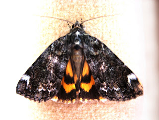
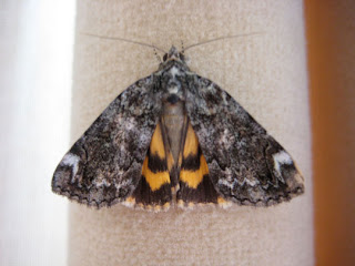
I took this photo of a moth that unknowingly came inside on my shirt.
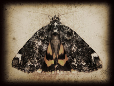
The photo on the right is the original, on the left is the photo that I manipulated the color and contrast. My daughter taught me how to create the framed vintage effect on the top photo layering several images and then combining them into one image.
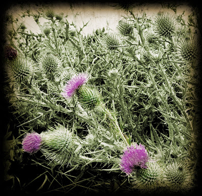
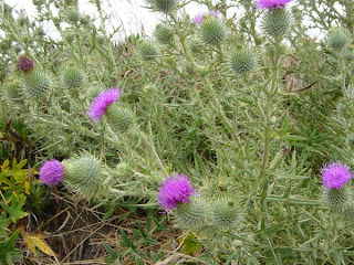
On the left is my original uncropped thistle photo. Once again I played with layers. I had my original as the bottom layer and placed a duplicate image on top. I desaturated the top image (turned it black and white) and then colorized it green. Using the eraser tool I erased the thistle flower from the top layer exposing the purple flowers from the bottom layer. I added an image of a vintage photo lens that I tinted sepia to frame the image and multiplied the layers.
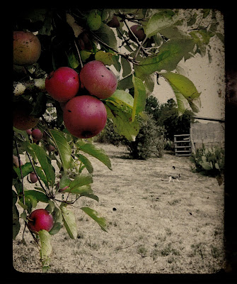
This apple tree photo was done in a similar way, de-saturating the top layer until there was just a hint of color, then using the eraser tool to remove areas from the top layer, exposing the colored layer below.
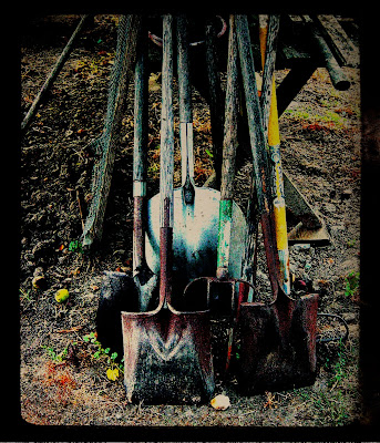
With the shovel photo, I mostly played with the contrast and color saturation.
I took these photos at a friends home in California a couple years ago, they have a lovely property filled with fruit trees and vegetable gardens.
Monday, June 16, 2008
Playing with tea bags and more... Birds and Bees
I painted a bird only using brown paint. After it was dry I glazed paint colors over the bird and leaves. I mixed a little brown in the colors to soften them, I wanted the painting to have a vintage look. After the bird and twig was painted I mixed a diluted brown wash and painted the fabric with it.
The papers are collaged to the fabric with Golden semi-gloss gel medium.
Several of the other images are from decorative wrapping papers, and a scan I made of a page from a children's school book from the 1800's. Then I cut green rice paper leaves and collaged them to the fabric.
I quilted it with wool batting. The areas not quilted are very puffy and look like trapunto. The dark tea bag with the bee really looks leathery and old.
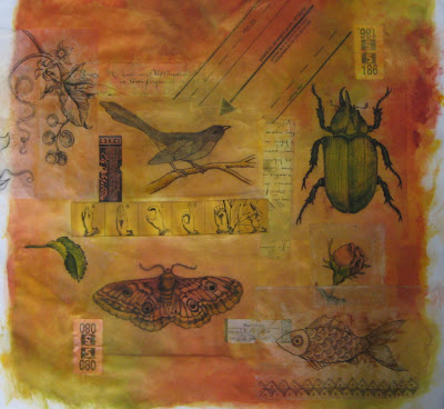
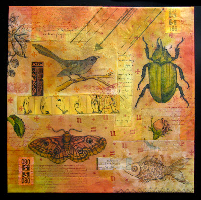
Illustrated Document No. 1
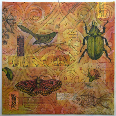
I added text and marks for background patterns with rubber stamps inked with Tsukineko Inks. Then I fused the fabric to a 12 inch square of wool felt. I folded the edges over and fused them to the back of the felt. This makes a nice flat and flexible piece for stitching.I was torn with how I should quilt this since the over all look began to feel like an aged document. I thought if I quilted around the elements like my first inclination would be, that it would be too predictable a thing to do, so I decided to take a risk and do quilting that was totally unrelated to the design of the piece but related to the aesthetic of the piece.
I found a gothic tile design that I modified into a pattern that could be stitched. After quilting the design I used a copper paint stick and shaded in some of the pattern. Then the bird and butterfly started to feel lost in the design so I pulled out some colored pencils and added a little color. Working with colored pencils is so fun. Once I started adding a little color here and there I found myself touching up little areas all over. Now I think it is done.
The total list of materials and techniques is:
white cotton fabric, teabags drawn on with permanent ink pen, tea labels, dry cleaning tags, sewing pattern, fabric with xeroxed imagery, textile paint, rubber stamps, Tsukineko inks, Shiva paint sticks, colored pencils, machine quilted on wool felt.
- Anonymous said...
I love this piece of art....Wonderful imagery! I am amazed by your creative ideas and appreciate your willingness to share. Could you tell me how you transfered the tile design to the surface of the paper quilt? thank you so much....
Susan- judy coates perez said...
Susan,
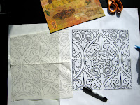
I traced the design onto tracing paper. (seen in the small photo) I cut a few small holes in the paper away from stitching lines and used scotch tape to stick the paper to the quilt by placing tape over the holes. I stitched through the paper and the quilt and then tore it away when I was done.- Carol Sloan said...
Judy,
I was working on the paper quilt that I posted a pic of, and had drawn out my quilting design on regular tracing paper. I tried the design on a random quilt sandwich (to make sure it was a "do-able" design).I had a lot of problems with the stitches pulling up or out when I removed the tracing paper. I tried a small design with some paper specically made for sewing a quilting design and another with the kimwipes. The kimwipes did the best but I still had a small amount of pulling on the stitches. How did you do yours/did you have the same problem? I took pics so that I could post a "hey, look ...you really don't want to do this" posting...if you have a second to help, I'd sure appreciate it.
Thanks- judy coates perez said...
Carol,
I think my machine does a pretty tight stitch to begin with. The smaller the stitches, the more it is going to perforate the paper making it tear easier. There is a lighter weight tracing paper that comes on a roll, architects use it, and it will tear easier, also I am sure you realize now you to have to pull the paper away gently. Your thread tension may be a little loose as well, try tightening it and see if that helps.- Ricë said...
i love this--fabulous! how do the colored pencils work for you? i've tried everything to set them, to keep them from smearing on fabric. you've probably addressed this somewhere else already--
- judy coates perez said...
I have never actually had a problem with them smearing, but you could try painting a light coat of fabric medium over them or give them a hit of artist spray fix.
The Artful Use of Tea Bags
1. After steeping your tea, set tea bag on the counter to dry and enjoy that fabulous warm cuppa tea with a dash of cream.
2. When tea bag is completely dry (not damp) carefully remove the staple, unfold top of bag and shake out the dried tea leaves into the trash. Unless you have thought of some way to incorporate these into your art. So far it has not occurred to me, but give me time....
3. Gently, pull seam apart down the length of the bag and fold out flat, brushing away any leaves that may be clinging to the paper.
4. Draw a design on a piece of sketch paper with a black marker to use as a guide and place tea bag on top of design. You should be able to faintly see the drawing through the tea bag. Trace your design onto the tea bag with a permanent ink marker, and fill in the details.
5. Now you can use this tea bag to collage onto paper or fabric using acrylic gel or matte medium.
6. Using acrylic medium, paint the fabric where you will be putting the tea bag a tad larger than the size of the tea bag paper.
7. Press the tea bag onto the wet medium and brush more medium over the top of the tea bag sealing it to your fabric.
८. After the medium dries you can glaze the drawing with layers of transparent paint, use colored pencils, or leave it as is in all its tea stained glory।
- Vicky aka stichr said...
Did you try stamping on the bag too? That should be easy also, right? I think I will dry out some coffee filters, I have the cone shaped ones that should make up to a nice "dresden plate", course I would call it something like "distressed plate"....*smile*...
- judy coates perez said...
anything you can do to paper should work here. it is just that it is very thin and a little delicate so it won't hold up to a lot of abuse until it has been adhered to something else.
I like the "distressed" plate idea. that could be fun.- Anonymous said...
Hi Judy. I've been making art with tea bags and candy wrappers for a few years now, ever since seeing them used in beautiful collages at an art gallery. I have a plastic container into which I put the dried tea and coffee grounds, and then sprinkle these back into the earth in my garden or at the local park -- recycling. Your work is beautiful and an inspiration! Rosa, NY
- judy coates perez said...
Hi Rosa, thanks.
Sprinkling the grounds in the garden is a great way to use those leaves and grounds. Unfortunately I don't have a yard where I live.- Anonymous said...
Judy- these paper quilts are stunning. I especially love the color and the quilting of the first one- unbelievable. Is the colored paper rice paper or do you use something else as well? When you do your quilting, do you use an additional layer of fabric or a stabilizer and then fuse the whole thing to peltex?
Thank you so much for sharing.
Kay- judy coates perez said...
Thanks Kay,
Each paper quilt has different kinds of paper. I try to explain in the description of each quilt what I have used to create the piece. The first one with the beetle only uses tea bags. The one with the bird shaman uses rice paper for the bird figure. All the papers except for the blue leaves on the bird shaman piece started out white and became colored by the painted fabric underneath or buy glazes of paint over the top.
I do not use a stabilizer, the layers of paper and paint give the piece enough body to stitch on. The last two pieces had all the stitching done before I fused them to the Peltex. The first one, I fused to Peltex and then quilted.- Meg in Albuquerque said...
I'm thinking that you could sprinkle the tea leaves on some PDF fabric and then use a spray bottle, get the fabric good and wet and see what happens after it dries. I've been saving those great triangle tea bags, I know someday I'll find the perfect use for them.
- Margaret S said...
hi, to give the decorated T bags a different surface finish you can wax them, i use an old iron and wax candle. great for antiquey finishes.
Mixed Media Paper Quilt #2
Mixed Media Paper Quilt #3
Using a fine point Sharpie, I drew this bird guy on the rice paper, I like to think of him/her as a kind of shaman. I cut out the figure from the paper and used gel medium to glue it to the background. Even though the colored papers were beautiful, they looked too strong for a background and competed with the image so I painted over them with pearl white textile paint.
The metallic paints have a transparent base which lets a little bit of color from the papers below show through, which I like. I cut out some leaves from colored papers and glued them down with the gel medium and painted the bird figure with washes of textile paint. Then stitched everything and fused it to a piece of Peltex.
Cloth, Paper, Metal
Next I collaged more paper images that were scanned from copyright free image sources and a mini Tarot card from wrapping paper. I painted the artichoke by glazing layers of transparent textile paint over the drawing. Then I painted a thin coat of white paint over the flower area before glazing it with purple paint.
I fused the finished collage to Peltex heavy weight interfacing and quilted the artichoke and a few leaves in the background.
Metal: After trimming the finished collage, I lightly scored an outline on a sheet of craft metal.
This is from a new line of metal being produced by Walnut Hollow. The metal is only available in some parts of the country right now but as the supply increases it will be available everywhere. (It is not yet on the website, but maybe soon.)
I measured an inch in from the inside of the scored outline, and cut out the center with an x-acto knife then trimmed the corners with scissors.
I wrapped the edges of the metal to the back and smoothed it down flat with a bone folder.
I set my sewing machine to a wide zig zag and stitched the metal to the collage, stitching through the metal on both sides. This will not hurt the sewing machine, the worst that will happen is dull the needle. Then you can use this needle for other metal sewing projects
I finished the frame by drawing designs on the metal with a pointed tool made for working on craft metal.
Painted Squash
A blow dryer can be a great tool to have on hand when you are painting. When you are glazing paint you want to build up the color gradually, the paint needs to dry between layers. This is really important if you are glazing several colors on the same area, if the layers are not dry the colors will mix and get muddy and you will not have depth in the color.
Next I painted the dark green on the squash and glazed a darker shade of green at the top and bottom of the squash to increase the illusion of it being dimensional.
The blossom is painted a similar golden yellow with a tiny bit of red added to the yellow to deepen the color.
I painted the background with Jaquard brown (not neopaque) straight from the jar.
I liked this initially but after a couple days when I came back and looked at it, the splotchiness bothered me and I felt like the flower did not have enough range in value, it looked a little flat. I think it is always good to set work aside and come back and look at it with a fresh eye. You will often see things that were not apparent before.
Using only violet paint, I glazed light washes on the flower in the center and in the shadows where the petal curls to give it more depth and I glazed light washes on areas of the leaves where there is some overlap to give them a little more definition and in a few places on the stems to give more dimension. Then I painted the whole brown back ground with medium to dark glazes of violet multiple times, this evened out the background and warmed it up to an aubergine tinted brown. Purple is the compliment of yellow, adding it to the background creates more contrast with the the colors of the plant making it pop and come forward from the background.
- Carol Sloan said...
Hi Judy
Great painting! I do love how you take it step by step and explain what you have done. What exactly are you using or what do you mean by "glazing" your color ? Do you actually use a glaze or is that what you call the process itself?
Carol- judy coates perez said...
thanks carol,
Glazing is the process of building up color by using transparent layers of paint. I add water or clear medium to the paint on the palette to thin the paint to a light wash. This allows more control over the color so it does not get too dark or too bright too fast- Cindy said...
I have another question, after looking at my paints (I couldn't wait! :)) How do you tell if a paint is transparent? Or are you making it transparent by adding the medium to it?
I have pre-ordered your DVD & am anxiously awaiting it! I also like the idea of a colour class on-line if possible. It is difficult for me to get to classes with my travel schedule.- judy coates perez said...
Hi Cindy,
Generally textile paints come in three different types. I will use Jaquard as an example, they make paints they call Textile color: these are the ones with a transparent base, Neopaque: have an opaque base, and Lumiere: the metallics have a semi transparent base.
To make the paints have less coverage for a technique like glazing, you can use a product Jaquard makes called Colorless Extender, this is basically the clear textile medium without the pigment added. So if you add a little paint to the extender you would have a very transparent paint, like a watercolor with the same viscosity of regular textile paint. This is probably the best method for glazing since it retains the viscosity of the paint and will not bleed on fabric the way adding a lot of water can.- Cheryl said...
Love this walk-through... Can you list what kinds of paints (brands) you used?
- judy coates perez said...
Cheryl,
I used Jaquard textile color paint in brown, violet and white and Stewart Gill Student grade textile paint green and yellow.
I really like the Stewart Gill paints for their pure pigments, the colors are wonderful. The Student grade paints are much more economical than the other lines of paint they sell in the little jars, but I don't think student grade is an appropriate name for these paints. They are closer to glazes than solid paint. I would not recommend these for a beginner/student, I could see people getting very frustrated using them in an illustrative way without more painting experience. My sister had a hard time working with them and had a lot more success when she switched to the Jaquard paint. They work really well for surface design techniques though.- Claudia said...
Judy, if you ever give a painting workshop - I'm SO there. I LOVE your work - and saw your quilts at the Denver Show a couple of weeks ago. Magazine photos just don't do them any justice, I was completely in awe.
- judy coates perez said...
Hi Claudia, thanks.
I have put together a workshop for painting, now it is just a matter of getting booked some where near you, lol. But in the mean time the next closest thing to taking a workshop will be to get the Quilting Arts workshop DVD I made on painting fabric for whole cloth quilts. It is one hour long and covers some of the basic techniques I use when painting.
Judy,your works blending paper and quilting are so wonderful! I really like how you have achieved a vintage look with this. Can you tell us how you did the border, it looks like couching.
Hi Karen, it is couching. When I make small quilts I trim them to size and do a straight stitch along the very edge. Then I take multiple yarns and couch them to the edge of the quilt with monofilament in the top and regular thread in the bobbin, twisting the yarns as I go.